A Sideways Look
Goldstein Heather nearly doubles the size of a west London house with an extension that prioritises light, space and craftsmanship – delivering a radically different family living experience compared to its former incarnation


Vertical extensions to London’s townhouses – upward into the attic, downward into the basement – are as ubiquitous in the capital as one-footed pigeons, Pret a Manger and tube strikes. However, it’s rarer to find a house that shifts sideways, which is what has happened to this end-of-terrace Victorian home in Stamford Brook, west London.
Architectural practice Goldstein Heather has nearly doubled the size of the property, and with it, has found a design language that is in harmonious dialogue with the period original – while the interior capitalises on the freedom of a blank canvas.

Homeowners Rowan and Angelina Bamford bought the house more than a decade ago and have three children. The couple are friends of Goldstein Heather co-founder Giles Heather, and came to him with initial thoughts of extending and remodelling their home: “They were feeling a bit constrained, so we were initially looking at doing a basement and rear extension,” he says. However, there was still a lingering desire to live more laterally that these changes wouldn’t solve, so they also looked around at other properties that could tick that box. Then, a breakthrough: the disused 1930s Territorial Army building next door came on the market, offering a unique opportunity to almost double the size of the existing house, at one side.
In developing the architectural language that could sit side-by-side with the period terrace, “we wanted something that was absolutely, recognisably contemporary, that no one would mistake for a tepid imitation,” continues Heather. “So the disposition of the windows all relates to the disposition in the existing terrace – but the language of the detail is completely different. The proportions are really carefully handled.”


The facade steps back as it rises up, with the top floor set back more considerably to accommodate a terrace accessed off the new main bedroom, with a zig-zagging lime-rendered facade. Widthways it is also divided, with a larger portion that is the width of the original house, to give a sense of symmetry, plus a recessed smaller section on the end of the terrace that, internally, contains the staircase. Heather describes how, in the evening sun, the top floor becomes beautifully animated by the light, as it casts shadows across the concertina, around the curve that abuts the original house next door, and underneath the overhanging level of coping.
There’s a softness to this house; it is relatively muted. For a massive extension, there’s a certain modesty to it


Defying Victorian convention, the house’s main entrance sits on the corner: Heather’s co-founder Simon Goldstein describes this feature as “an architectural tour de force, in terms of technicality,” with the main door sitting under a fair-faced concrete double arch that almost gives the illusion that it supports the rest of the side of the house above it. Both credit the main contractor, IC&T Projects, for the skill to do all the casting on site (the concrete also continues as render on the ground and first floors). “They know how to do things with the same real craft, care and love for materials as we do,” says Goldstein of the contractors.
The arch that marks the entrance is a prelude to what visitors find when they step through the door: a rhythmic colonnade of arches that feels like an utter surprise in this domestic context. “There’s a certain classical resonance to them, but there’s also a Mediterranean feel,” says Heather, “The Bauwerk paint used has a texture to it that’s very soft – it’s almost gallery-like.”

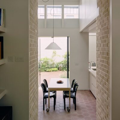
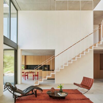
With their clients having felt deprived of light and large, open spaces in their old home next door, the architects have delivered the antidote here, with the sculptural magnificence of the arches matched by a double-height vertical opening, the void filled by a bespoke light fixture. On the ground floor, the extension contains a large kitchen (in bespoke ash joinery, designed with the architects in collaboration with Sebastian Cox) plus a dining and living space.
Upstairs there’s a lounge area that is open to the kitchen below, fostering the kind of inter-generational connectivity that was missing from family life before. One floor up, the children’s bedrooms span the old and new parts of the house, while the top floor’s main bedroom suite occupies the whole footprint of the extension.

While the area for the staircase was dictated by the decision to retain a sense of symmetry externally – thus leaving a (comparatively) narrow gap at the side for circulation – the size limitation has been compensated for by some lovely craftsmanship. “We’d seen a lot of nice staircases in other projects, and it was our absolute ambition to produce one of our own,” says Goldstein. In Douglas fir, the stairs rise up sinuously through the house, with a gorgeously minimal curving oak handrail that traces every switch-back angle.


Heather and Goldstein feel that this house breaks free of the conventions that dictate what a new London house should look like. “We’ve always been interested in the craft of architecture, and have sometimes been frustrated with the narrowness of some contemporary architecture, in terms of what’s considered legitimate or illegitimate,” says Heather. “So much of it is shiny and rigid, and all about flawlessness – but there’s a softness to this house; it is relatively muted. For a massive extension, there’s a certain modesty to it.”