Stone & Steel
A north London home is expanded upwards more than outwards by DGN Studio, with a quietly expressive use of materials that harmonises the whole

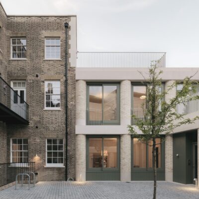
London’s built infrastructure is intrinsically linked to its yellow- and brown-toned stock bricks – but that doesn’t mean that architects shouldn’t be looking to more sustainable alternatives when it comes to upgrading the fabric of the capital’s homes. To extend this north London house, DGN Studio used sandstone bricks: not only do they create a soft appearance that is echoed throughout the house’s interiors – right to the top of its peaceful new attic room – but they have environmental benefits, too.
“They’re so much better in terms of embodied energy than clay bricks,” explains Daniel Goodacre, co-founder of the studio alongside Geraldine Ng. “It also fitted the wall construction best, because we wanted to have a fully breathable build – using hemp insulation, lime mortar and lime plaster rather than sealing everything off with cement and PIR boards.” The result is a healthier wall that regulates moisture naturally and offers what he calls “a more sustainable, more grounded kind of construction.”


The house had a small garden, so the new addition was never going to be a generous one. Instead, the architects mostly extended into the side return and focused on a recurring palette of high-quality materials, with an emphasis on height to create a feeling of generosity. The extension sits three steps down from the original house and is topped by a run of clerestory windows and a supplementary rooflight, delivering an impressively tall ceiling height and an abundance of daylight. “What it does is maintain that connection to the sky; every time you come in, you’re slightly drawn upwards,” says Ng.
The angular steel-framed glazing (with two sets of doors to the garden, as well as the clerestory windows) offer a material contrast: “We like that combination of the roughness and earthiness of the stone, and the sharper finishes,” says Goodacre. Concrete sills and lintels, cast on site, are the final note in this harmonious chord, gently decorative in their speckled appearance but in-keeping with the theme of robust, honest materials.


We like that combination of the roughness and earthiness of the stone, and the sharper finishes
DGN Studio also designed the kitchen, its cast-concrete worktops and steel-fronted drawers, shelves and splashback echoing the materials outside; the stone brickwork also continues for some of the interior walls. A curving island counter is the kitchen’s centrepiece – “it’s less of an island and more of a central table,” says Ng, who adds that this was one of the hardest parts of the space to get right.
In the end, the island’s unusual apostrophe shape solved the problem: the narrow end houses the sink, its shallow depth meaning the homeowners can still lean over and open a little side window, while the ballooning curved end is compact but still has enough room to sit around. The unusual bright-blue stools that sit here were made by the builder, after the homeowners had admired the rustic look of something similar that had been casually knocked-up on site as a temporary place to perch.


The original, front part of the house retains its period charm. Here, the architects’ major interventions were to shift the dividing wall between the hallway and the living room, to create a bigger hallway with lots of storage fit for family life; and to introduce floor-to-ceiling sliding doors (so, more like sliding walls) to deliver flexibility regarding closing off the dining room from both the new extension and the hallway. There has also been a raft of repairs and upgrades that you can’t see, including levelled and insulated floors, and the correction of the staircase, which was listing to one side.


The layout continues upwards in half-storeys, with bathrooms on the rear side of the house, and bedrooms in the centre and front (a large bedroom has been turned into the studio of one of the homeowners, a fashion designer). Early on in the project, the architects worked with independent creative director Sarah Izod on the look and feel of the interiors, developing a narrative of simple, natural and neutral materials with the odd shot of colour, such as the tiles in the bathrooms, and the microcement wall finish in the compact attic shower room.
At the top of the house there have been further changes: “We wanted something that felt quite earthy at ground level, but as you went up the house, things became lighter and more refined in terms of the materials,” says Goodacre. A private terraced area sits on top of the house’s original outrigger, accessed from a near-invisible door off the staircase; half a floor higher, there’s a new attic guest-room-cum-snug, with a full-width dormer.


There are beautiful, well-thought-through details everywhere you look in this project, from the integrated planters just outside the sliding attic windows that add some greenery high in the sky, to the way that the recesses between the steel kitchen drawers mirror the slim steel uprights of the clerestory windows outside. Goodacre says “we are quite detail obsessed, but for us it’s about how those details come together. Sometimes in architecture, the detail can sometimes feel a bit obsessive: we’ve tried to give a slight informality to it as well. Homes should be adaptable, and pragmatic. That’s when you enjoy being in a space.”