Better Together
In Rome, Studiotamat’s Casa Continua features rich terrazzo, restored parquet, and glazed partitions and doors that create a flowing sequence of spaces
For the recently retired homeowner of this apartment in Rome, life revolves around the kitchen – and she’s recently gone to great lengths to make sure that it sits at the heart of her home, both literally and metaphorically.
Having lived here for 30 years, she asked local architecture and design practice Studiotamat to rethink the 115 sqm apartment in the city’s Flaminio neighbourhood, putting the kitchen – now enclosed by glazed burgundy partitions – at its core, turning cooking into more of a shared experience.
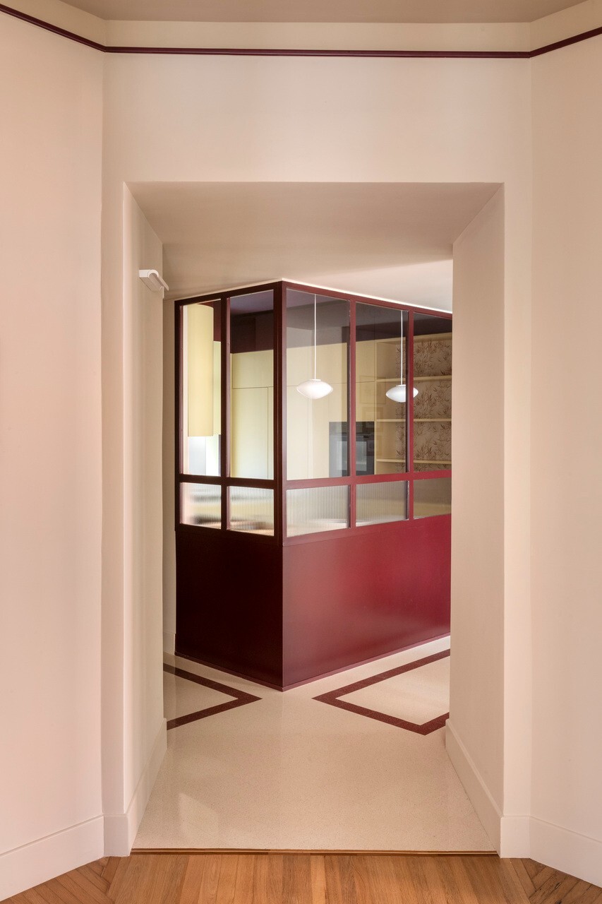
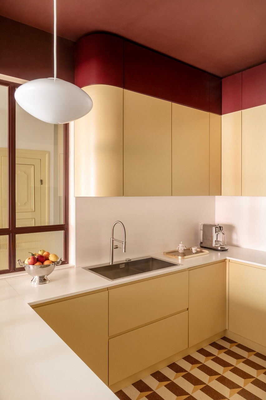
“As her daily routines changed over time, she felt that the existing layout no longer reflected the way she actually lived. The renovation was conceived around her current lifestyle, placing conviviality, flexibility and comfort at the centre of the design,” says Studiotamat’s co-founder Valentina Paiola of her client. The key was to make the kitchen feel like it was part of the life of the wider apartment, whether she was cooking for others or on her own.
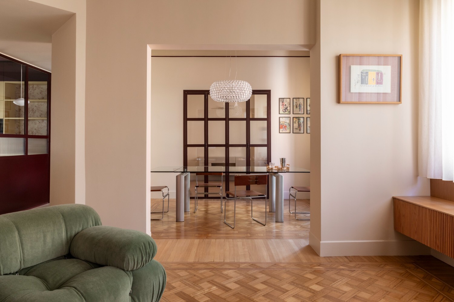
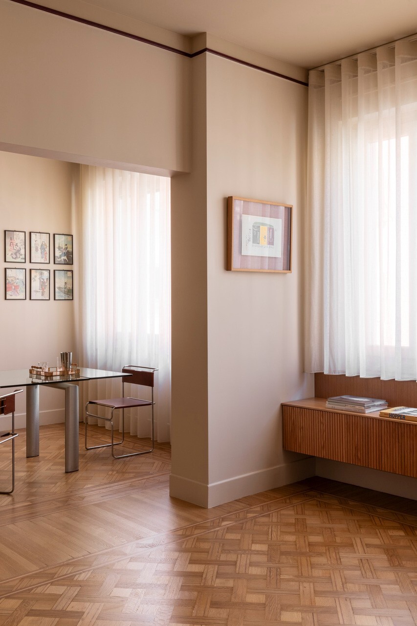
That theme of a convivial openness – without resorting to a fully open living experience – is continued elsewhere (and Studiotamat has christened this project Casa Continua to express this ethos). Around the central volume of the kitchen, the other rooms revolve, with the living and dining areas now forming a continuous sequence rather than being closed off from one another. The distinctive basketweave-patterned parquet floor that runs throughout has been carefully restored.
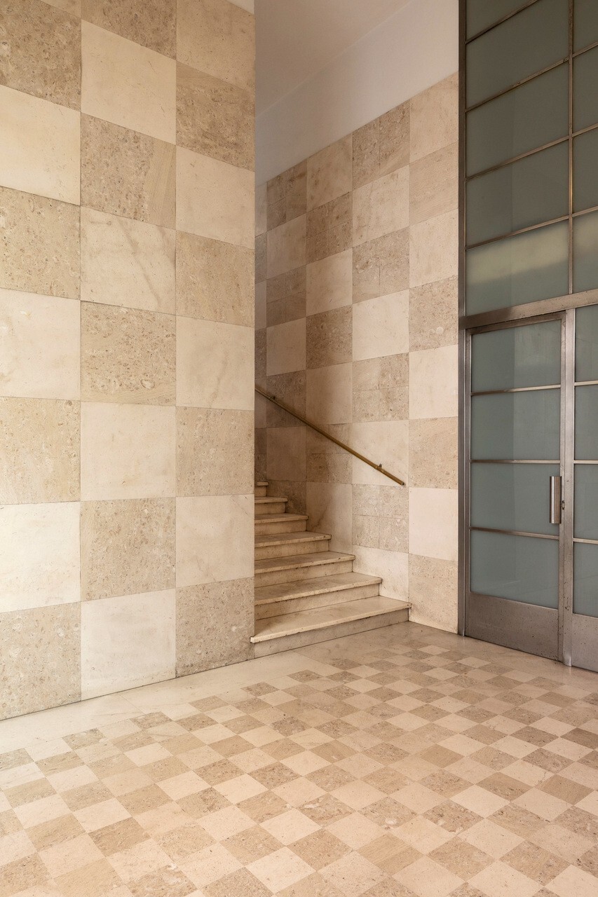
The building’s rationalist architectural language – its entrance foyer boasts an incredible checkerboard of marble covering the floors and walls – helped to inform the design language, too. “The entrance hall was one of the most inspiring elements of the building. We were fascinated by the dialogue between straight lines and curves, between the rigorous geometry of the floor and the sculptural presence of the helical staircase,” says Paiola.
Rather than borrow these ideas directly, the studio instead translated their principles, for example, in the curved joinery and the way colour emphasises certain architectural elements. The burgundy shade used for Casa Continua’s kitchen partitions is repeated as a motif throughout the apartment. It’s picked out at picture-rail height close to the ceiling, as a design thread that runs through the apartment, and has also been used for folding glazed doors that allow the library to be opened up to the dining area.
In the circulatory spaces, a custom terrazzo floor has been installed, inlaid with oblongs in the same burgundy tone; while the kitchen itself features a bolder burgundy-striped terrazzo punctuated by yellow triangles.
The internal glazing “has changed the perception of the apartment significantly,” says Paiola. “Before the renovation, the spaces felt more fragmented and disconnected. Now, natural light and views travel much further through the apartment, creating a greater sense of openness while preserving the identity of each room. The apartment does feel larger – but perhaps more importantly, it feels more connected.”
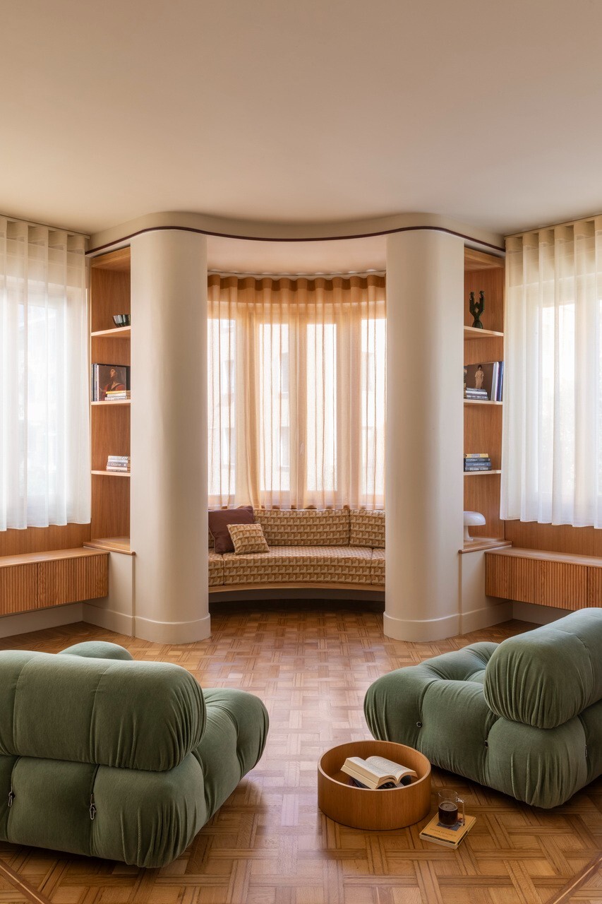
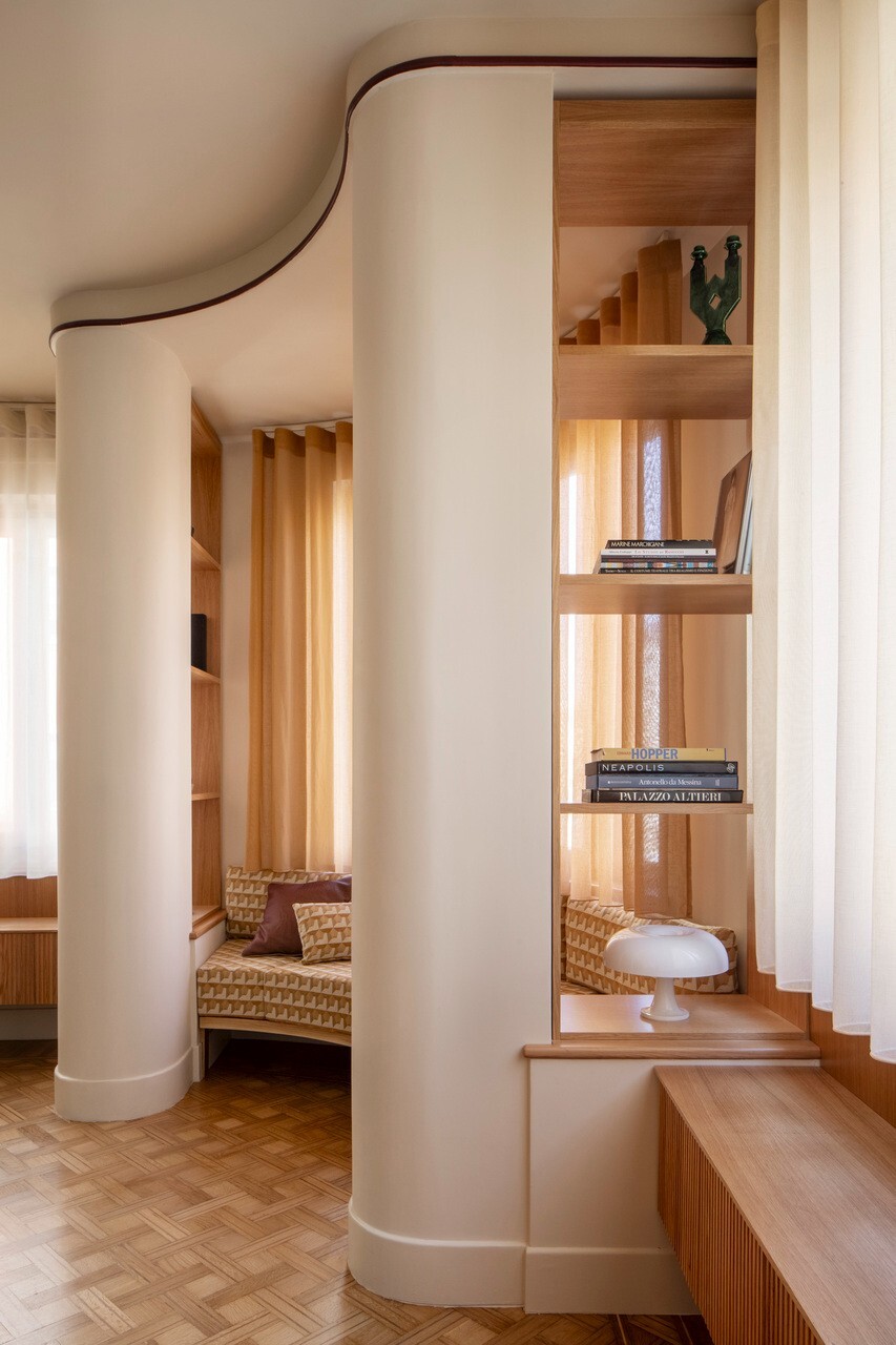
In the living area, what could have been a design constraint – the presence of two structural columns close to the perimeter of the building’s curved corner – has been turned into a moment of pause. Here, Studiotamat has enclosed the columns and created a sinuous seating nook at the window, with open oak bookshelves on either side, bridging the small gap between the columns and the wall. The room features some sculptural Italian design pieces, including B&B Italia’s Camaleonda sofas and Artemide’s Tolomeo Mega Floor lamp.


The seating nook’s custom banquette is upholstered in l’Opificio’s Relief fabric in caramel tones, its trompe-l’oeil three-dimensional pattern a pleasing design reference back to the parquet floor beneath and the terrazzo floor in the kitchen. Subtle back-and-forth references – such as this, and the recurring colour palette – are an important way to create continuity in a small apartment.
“Repeated colours, materials and geometric references help establish a sense of cohesion and allow the eye to move naturally through the space. These connections do not need to be immediately apparent; in fact, we believe they are more successful when they are discovered gradually,” says Paiola.
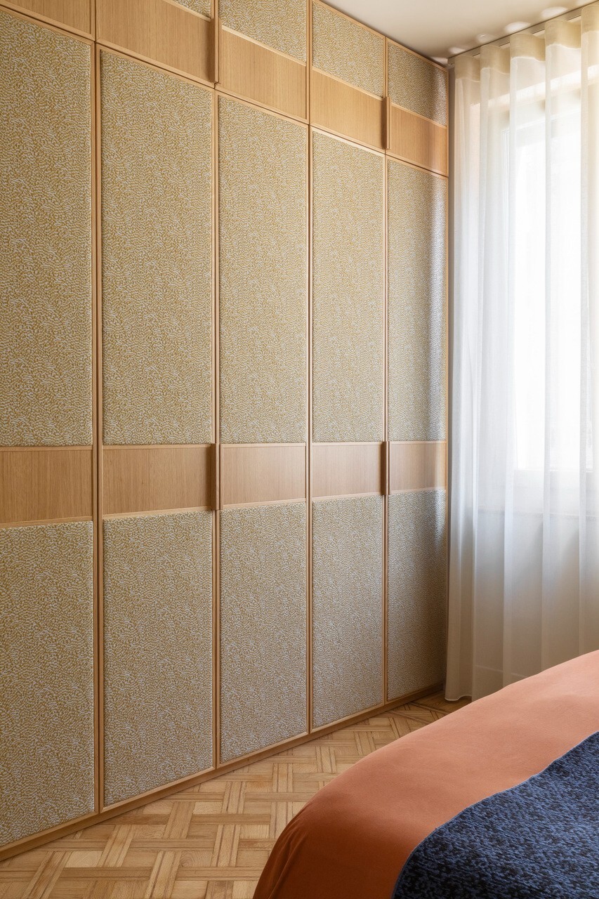
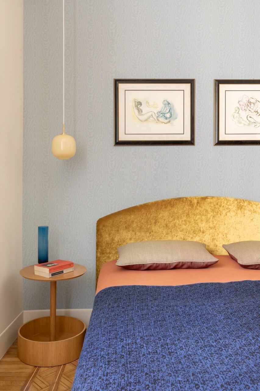
That said, the mood noticeably shifts in the bedroom, with the introduction of some opulent surfaces and materials. One wall is clad in Harlequin’s Elsworthy moiré wallcovering in a cool blue, echoing traditional silk, while the headboard of the Flou bed is upholstered in an ochre-coloured velvet that shines almost like gold. Oak wardrobes, inset with l’Opificio’s Filigrana fabric, wrap the room. Nothing feels overdone: these little decadences are countered by the simplicity of the Louis Poulsen VL45 Radiohus pendants hanging by the bed.
Paiola says that the project’s biggest challenge was “finding the right balance between openness and definition. We were not interested in creating an undifferentiated open-plan space, but rather a tailored sense of fluidity.”